Project detail
Seamless Product Browsing
I redesigned the iOS catalog interaction to make opening and closing product pages feel instant and “seamless”, so users can explore more items without fatigue and place more orders.
Context
The catalog was a simple scrolling list: each tap opened a separate product page, and closing it required reaching for the top back button or using the edge‑swipe gesture. Repeating this dozens of times was tiring and limited how many products users explored per session.
Goal
The goal was to increase time spent exploring products and the number of items viewed per session, without making the app feel heavier or slower.
If users could open, inspect and close product pages with almost no effort, they would be more likely to discover relevant items and eventually place more orders.
Solution
Zoom‑in product details
Tapping a product now triggers a Pinterest‑style zoom transition: the card smoothly expands into the product page, which is already loaded. To close it, the user simply swipes down, zooming back to the same position in the list. This removes friction from the back navigation and keeps the browsing flow uninterrupted.
Result
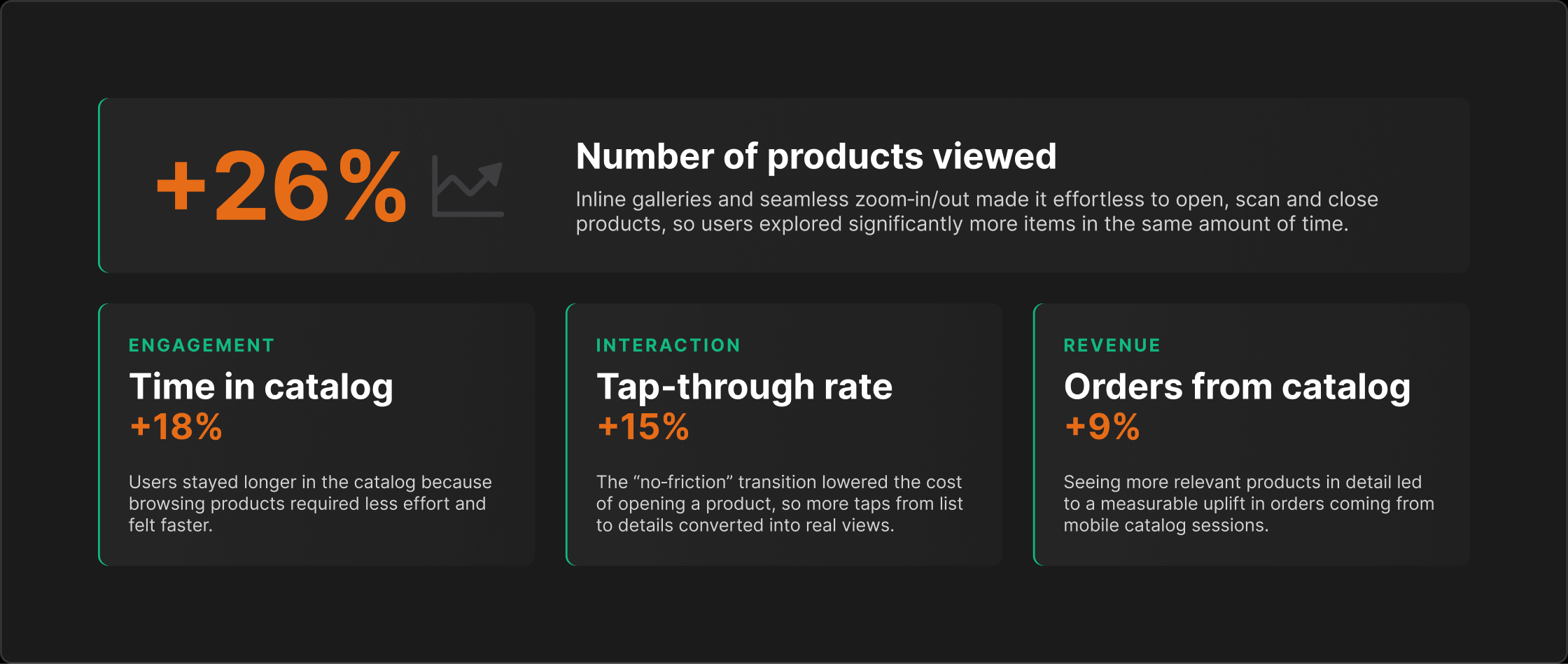
Time spent in catalog per active session: +18%
Users stayed longer because exploring products required less effort and felt faster.Number of products viewed per session: +26%
Inline galleries and effortless zoom‑in/out made it easy to inspect more items in the same time.Tap‑through rate from catalog to product details: +15%
The “no‑friction” transition lowered the cost of opening a product.Conversion to order from catalog sessions: +9%
More relevant products viewed in detail led to more orders from mobile catalog traffic.
Exact figures are omitted for confidentiality, but the pattern was clear: less friction in navigation → more exploration → more purchases.
My role
As Sr. Product Designer, I defined the problem and success metrics, designed the zoom transition and inline galleries, specified motion and scroll behaviour, and worked with iOS engineers to ship a smooth, production‑ready experience.
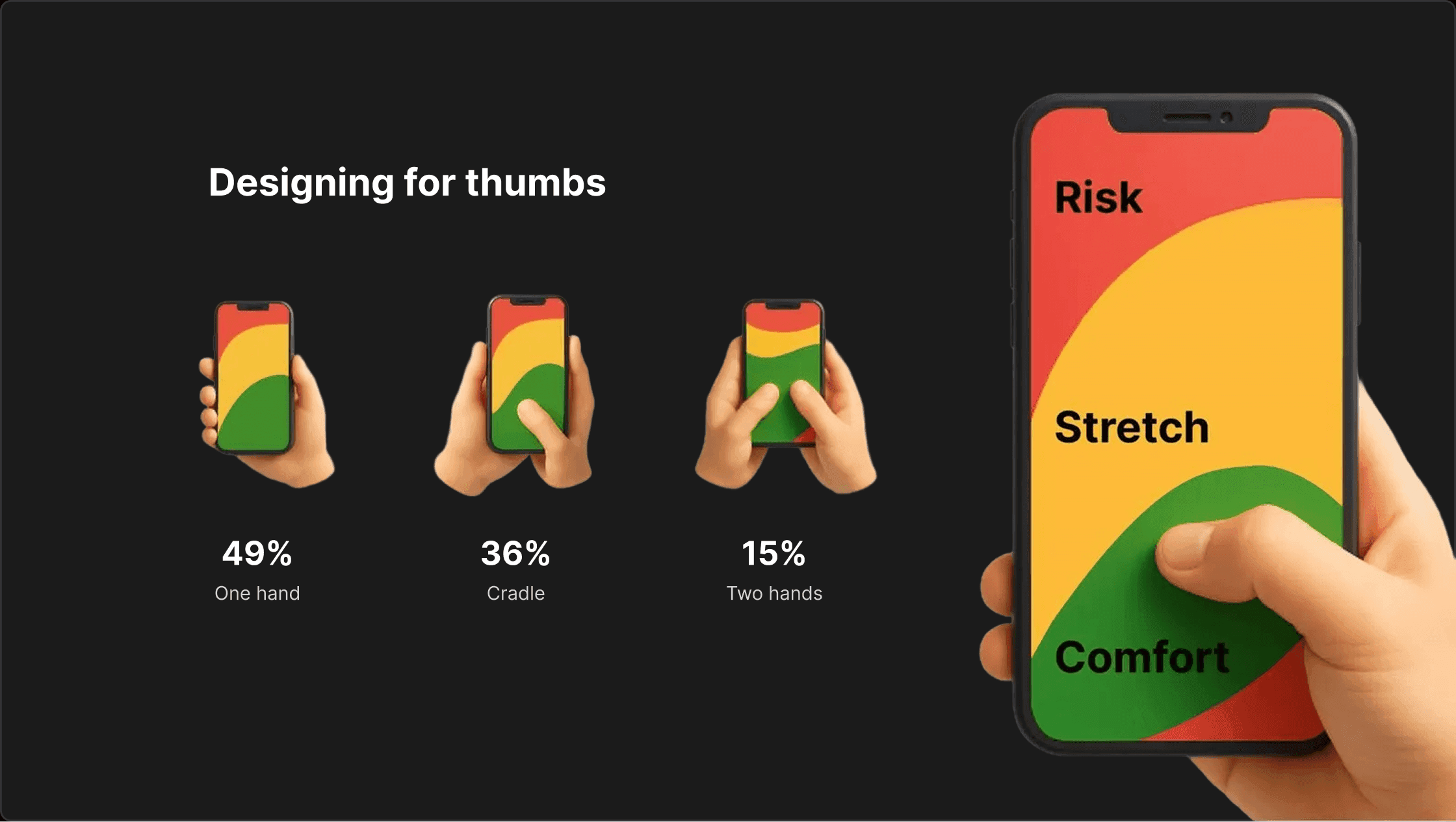
Designing for thumbs
Most people don’t browse a catalog with two perfect hands on the phone. They use thumbs.
49% use one hand
36% cradle the phone (hold with one hand, interact with the other)
15% use two hands
This has a direct impact on how navigation should work. If closing a product card requires stretching to a top “Back” button, we create unnecessary friction — especially when users repeat this action dozens of times.
That’s why in this interaction I relied on thumb‑friendly gestures:
Open product: simple tap from the catalog list
Close product: swipe down anywhere on the screen
Stay in context: user returns to the same scroll position in the list
I designed the flow so that all primary actions live inside the green thumb zone: easy to reach, comfortable to repeat. The result is not just a cleaner animation, but a catalog that feels natural to use with one hand.
Recommended reads:
How to design for thumbs in the Era of Huge Screens
One-Handed Mobile Use – Luke Wroblewski
