Project detail
Profile Redesign
Kasta is a Ukrainian e‑commerce marketplace with a paid loyalty program, Kasta Black. As the Lead Designer, I redesigned the Profile experience on iOS, Android and web, turning a flat list of menu items into a personal hub for orders, favourites, cashback and instalments — and making the value of Kasta Black visible by default.
Context & my role
As the Lead Designer, I owned this project end‑to‑end: from understanding user and business needs to information architecture, UX/UI design and implementation support.
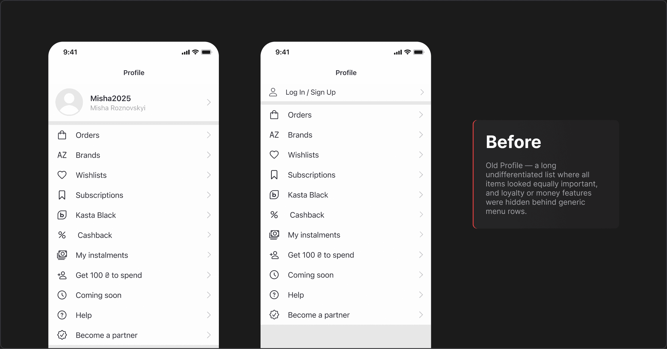
The Profile screen had gradually become a “catch‑all” list: orders, brands, wishlists, tracking, Kasta Black, cashback, instalments, referral program, help and more — all with the same visual weight. My goal was to reorganise this space around what users actually come here to do: check their orders, see their money and understand how Kasta Black works for them.
Problem
The flat list created several problems:
Users struggled to find active orders and saved items quickly.
Kasta Black, cashback and instalments were effectively hidden behind generic menu rows.
The Profile felt like a settings page, not a personal account or money dashboard.
Goals
Turn Profile into a central hub for orders, favourites and money.
Make Kasta Black, cashback and instalments clearly visible and easy to understand.
Reduce support requests related to “Where is my order?”
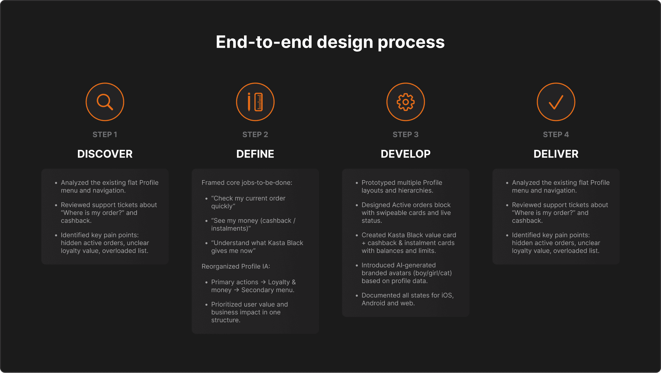
Process & approach
I followed a lightweight Double Diamond process, structured around Profile jobs‑to‑be‑done:
Discover: analysed the existing menu structure and support tickets to understand where people were getting stuck.
Define: mapped key JTBD — “check my order quickly”, “come back to saved items”, “see how much money I have in cashback/instalments”, “understand what Kasta Black gives me right now” — and built a new content hierarchy around them.
Develop: prototyped several Profile layouts, explored different positions for orders, loyalty and money blocks, and worked through edge cases (no orders, multiple orders, no Black, zero cashback, maxed‑out instalment limit).
Deliver: finalised designs for mobile and web, documented all states and avatar logic, and supported engineers and QA during implementation.
Solution
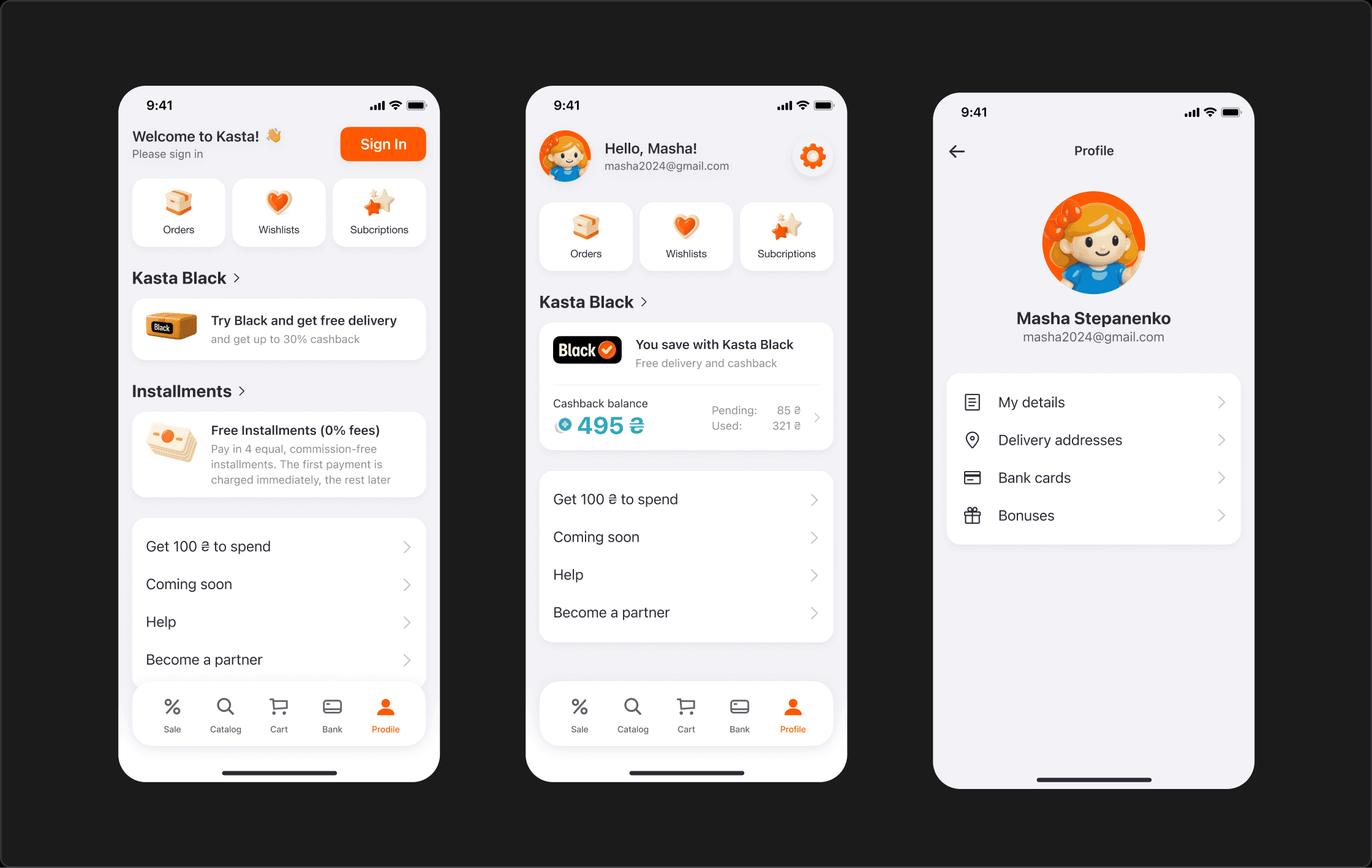
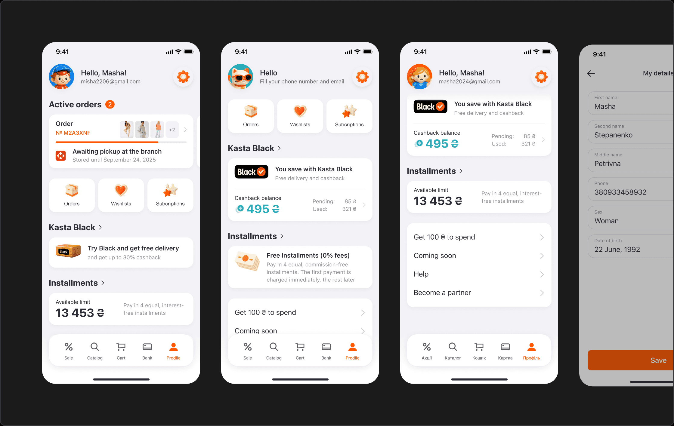
The new Profile is built from a set of clear blocks instead of one long list:
A personal header with greeting, avatar and email, so it feels like “my account”, not just settings.
Three primary actions at the top — Orders, Wishlists, Tracking — covering the most frequent tasks in one tap.A Loyalty & money area with dedicated cards for Kasta Black and Instalments, showing live balances and limits.
A compact secondary menu at the bottom for less critical items like referral program, Coming soon, Help and Become a partner.
This structure reflects how users think: first orders, then money and benefits, then everything else.
Key UX details
Several UX decisions were critical to the final result:
Active orders block When there are active orders, a large “Active orders” block appears at the top of the Profile. Each order card shows the latest status and expected pickup/delivery date. If there are multiple orders, users can swipe horizontally through them, instead of hunting for status deep in the menu.
Kasta Black, cashback and instalments as a money dashboard Kasta Black has its own value card with a short explanation of benefits (free delivery, cashback). Under it, a cashback card shows available, pending and used amounts, and an instalment card displays the available limit. Together they work as a small “money dashboard” that invites users to come back and use their balance.
Secondary links moved out of the way Referral bonus, Coming soon, Help and Become a partner are still present but moved into a simple list at the bottom, so they no longer distract from core tasks.
Micro‑improvements
Avatars & brand feel
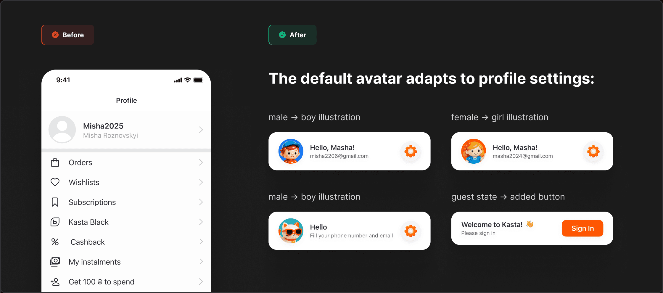
Before the redesign, users who didn’t upload a photo all saw the same generic default icon.
I introduced four branded default illustrations that react to profile
If the user’s gender is set to male, the avatar shows a boy illustration.
If gender is set to female, it shows a girl illustration.
If gender is not specified, it shows a cat illustration.
All illustrations were created with the help of AI and refined to match the Kasta brandbook.
This small change made the Profile feel more friendly and personalised, and brought more of the Kasta brand into the everyday experience.
Impact
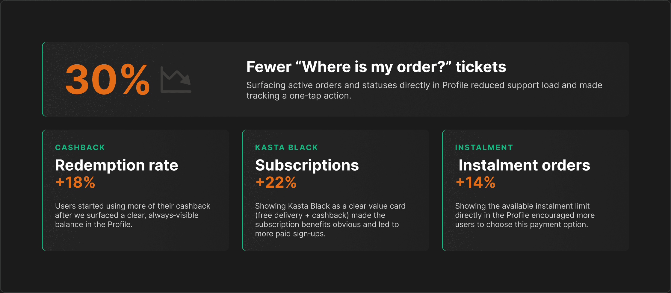
Around 75% of Kasta purchases happen on mobile, so improving the Profile there had a direct effect on core business metrics. After the redesign we observed:
Support tickets about order status decreased by 30%, because active orders and their latest statuses became visible directly in the Profile.
Cashback redemption rate increased by 18%, driven by a clear cashback card showing available, pending and used amounts.
Kasta Black subscriptions grew by 22% once the program’s value and savings were surfaced as a dedicated card instead of a hidden menu row.
The share of orders paid with instalments increased by 14%, after making the available instalment limit prominent on the Profile screen.
These numbers are indicative to show the order of impact; exact internal figures are omitted for confidentiality.