Project detail
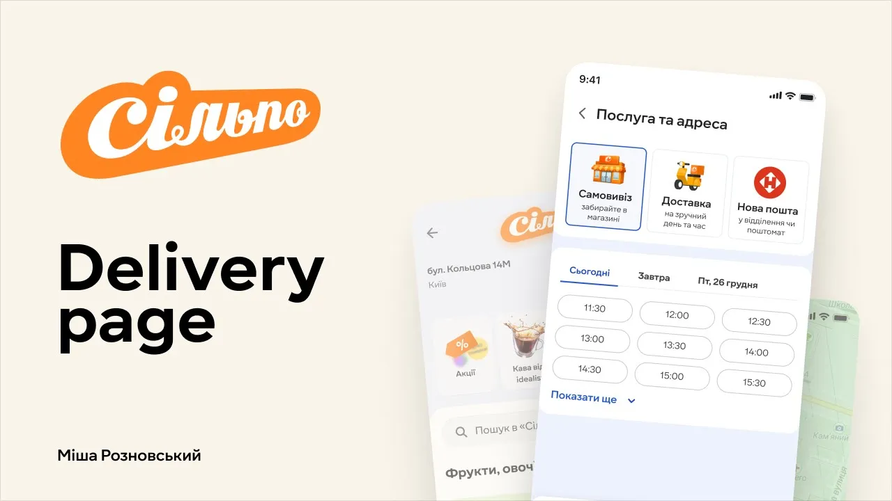
Silpo • Service & Delivery Address Redesign
Silpo is a Ukrainian supermarket chain that combines everyday grocery shopping with a playful, design-driven atmosphere, offering a wide range of fresh products, own brands, and themed stores that turn each visit into a small adventure for customers and families.
Context
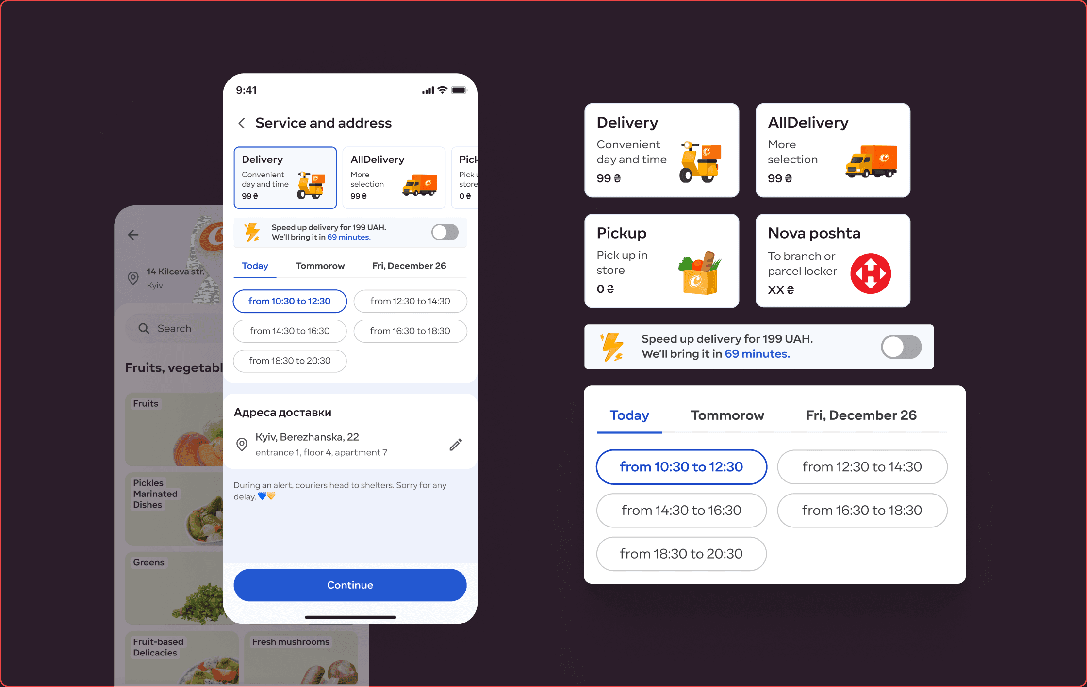
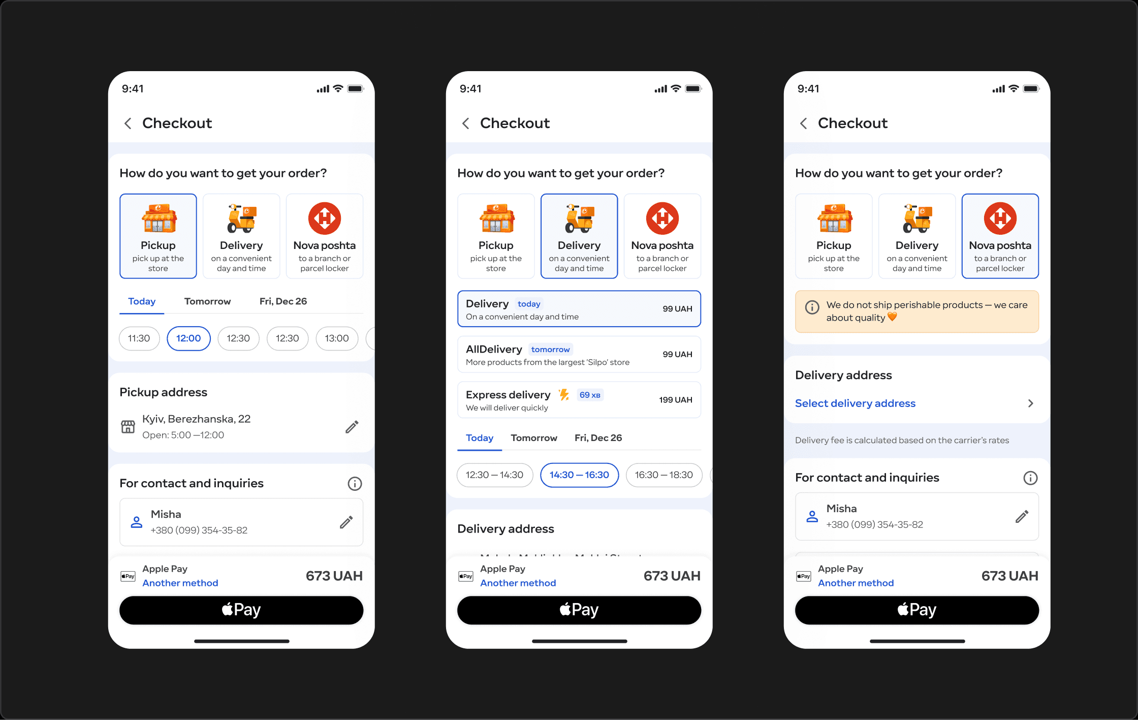
Silpo offers multiple delivery services with different delivery times and assortments. Users choose delivery service and address from a single screen, accessed from the delivery widget or during checkout.
Although analytics showed no critical issues, the screen was hard to understand and poorly scalable.
Problem
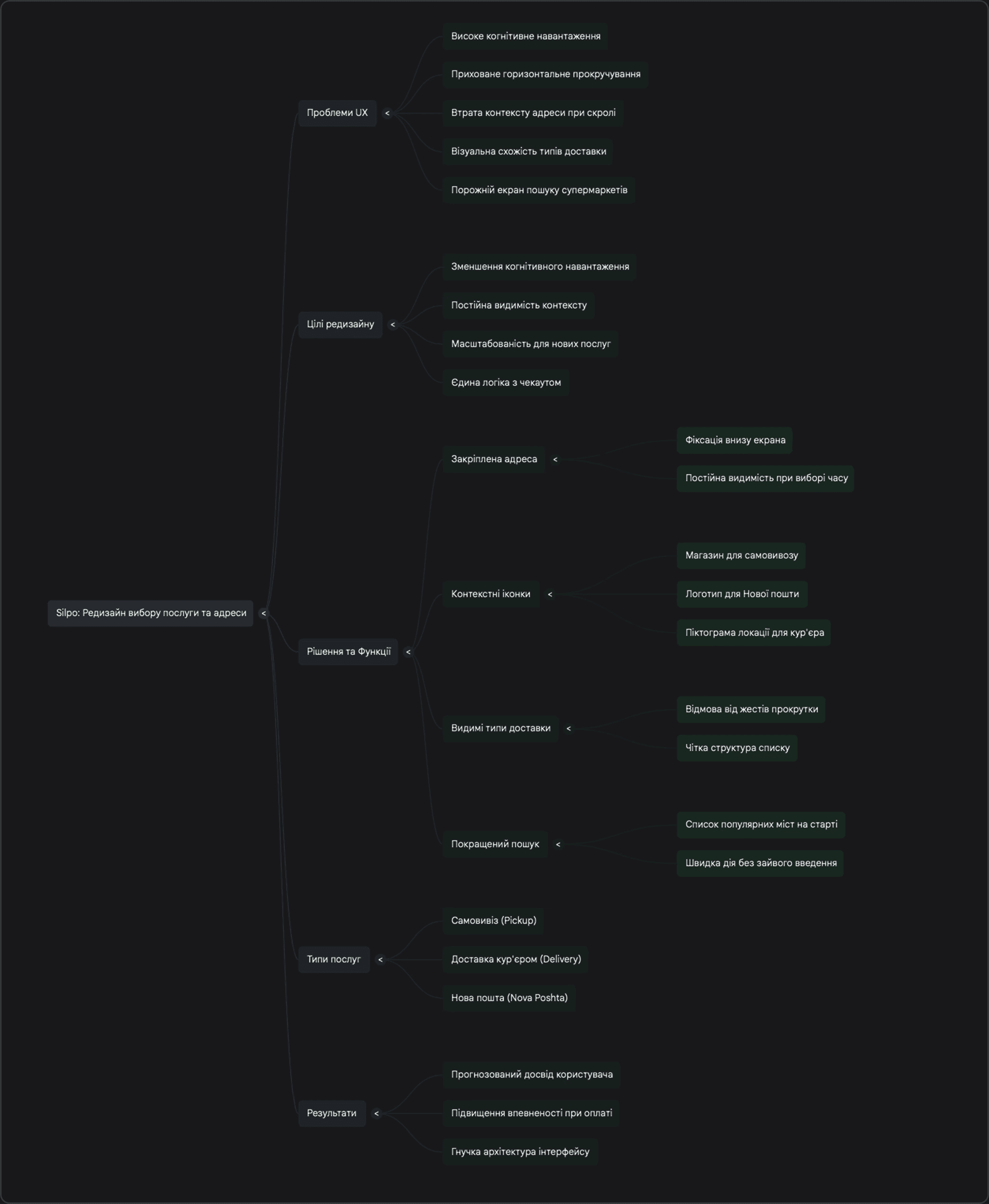
Users had to choose between multiple delivery services, time slots, and unfamiliar service names simultaneously.
This increased cognitive load, caused confusion around services like All Delivery, and made the decision process less confident during checkout.
Goal
Make delivery selection clear, predictable, and confidence-driven, especially for new users.
Solution
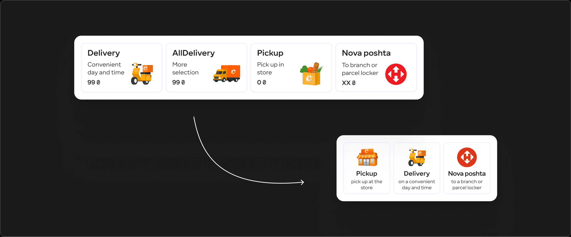
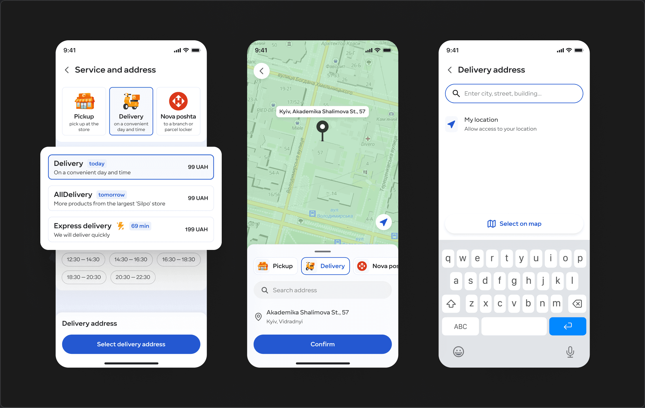
Reduced delivery services from 4 to 3
Instead of mixing service type, delivery speed, and assortment into multiple delivery options, I simplified the model to three clear delivery services.
This reduced complexity and removed duplicated or overlapping options that were hard to distinguish.
No hidden delivery types
All delivery services are visible without horizontal scrolling, making the solution scalable.
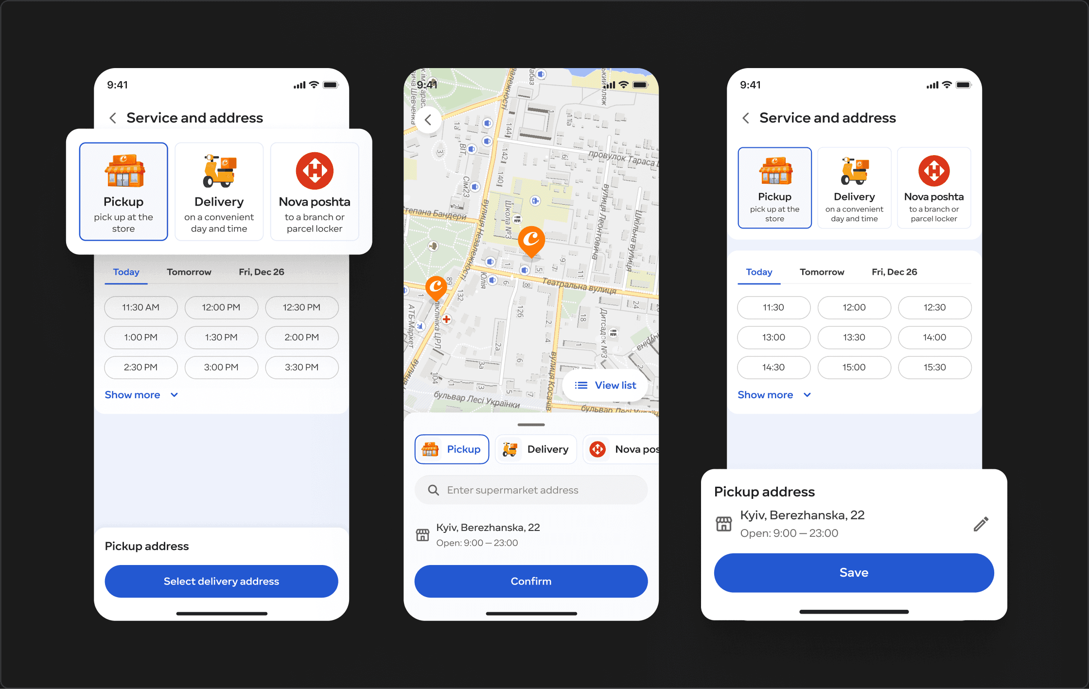
Pinned delivery address
The selected delivery address is fixed at the bottom of the screen and always visible.
This prevents context loss when many delivery time slots are available and the address would otherwise scroll out of view.
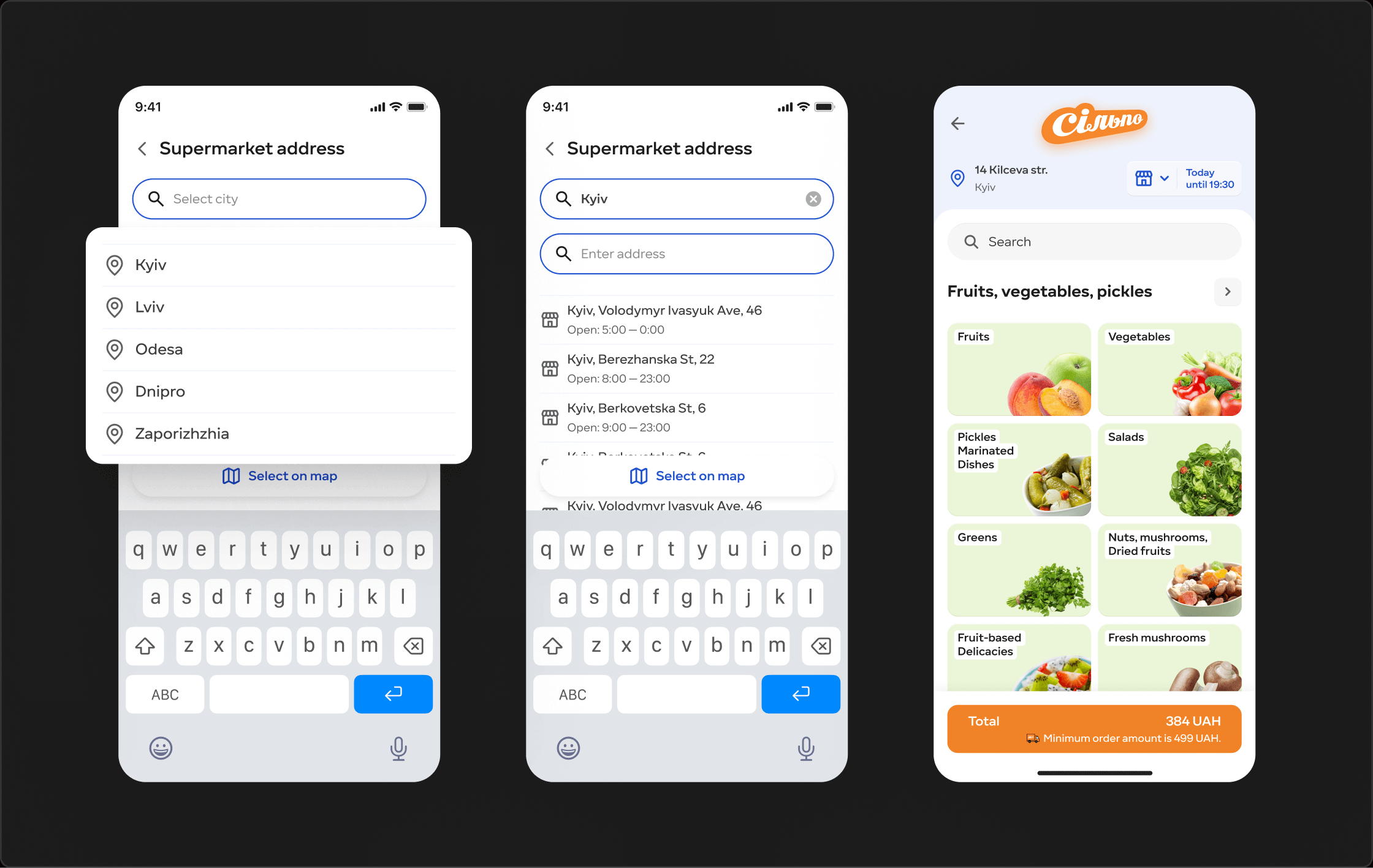
Improved empty state
Instead of a blank screen, users can select from popular cities immediately.
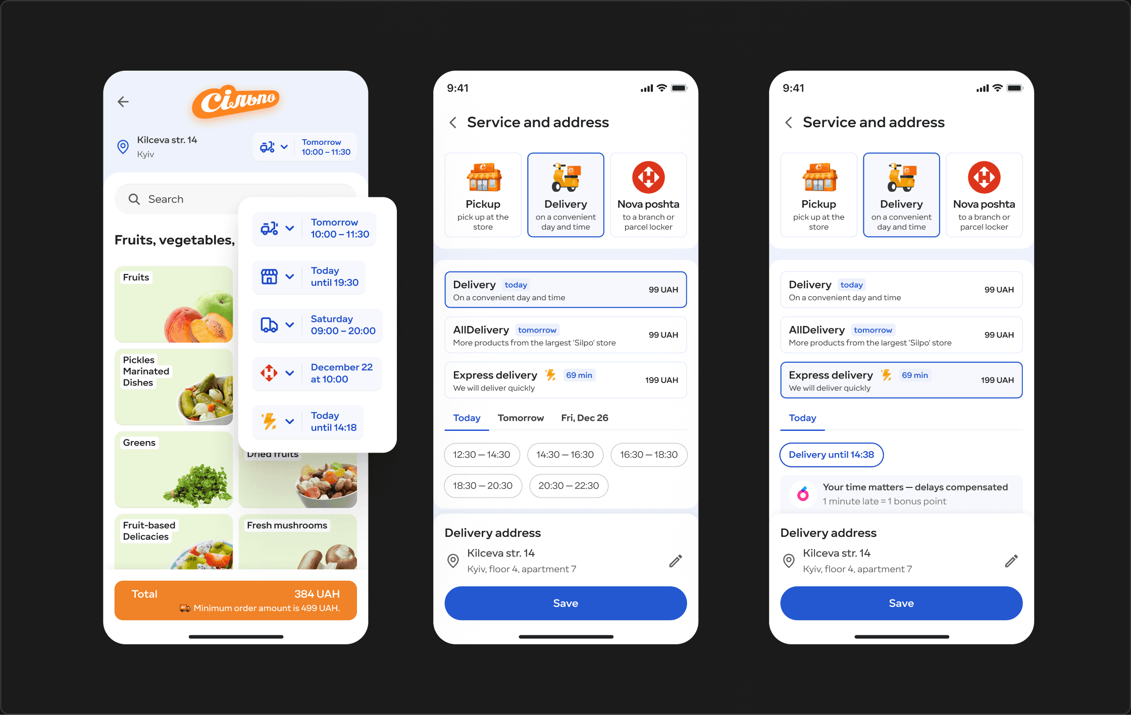
Separation of service and delivery speed
Delivery service (how the order is delivered) was separated from delivery speed and assortment (when and what can be delivered).
This helped users make one clear decision at a time instead of comparing multiple complex options.
Clear decision hierarchy
Choose delivery service
Choose delivery speed / time slot
Confirm delivery address
This structure significantly reduced cognitive load and made the flow more predictable.
Context-aware address icons
Address icons change based on delivery type: store pickup, Nova Poshta, or courier delivery, enabling instant recognition.
Consistent logic across checkout
The same interaction patterns were applied to checkout, ensuring a unified experience.
Outcome
Clear delivery decision flow
Reduced cognitive load
Better understanding of delivery options
Higher confidence at checkout
Scalable structure for future services
JTBD
When I order groceries, I want to clearly understand when and how I’ll receive my order, so I can choose confidently.